Cerutti
The Brief
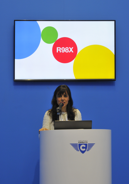
To realize the graphics of the stand that would appear at Drupa 2016, the most important print and packaging exhibition, as well as to develop crossmedial and multichannel solutions.
Solution
To develop a verbal and visual strategy in line with the event, focusing on the ideals of innovation and quality that always set the production of Cerruti Group apart.
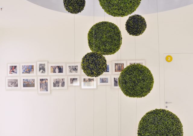
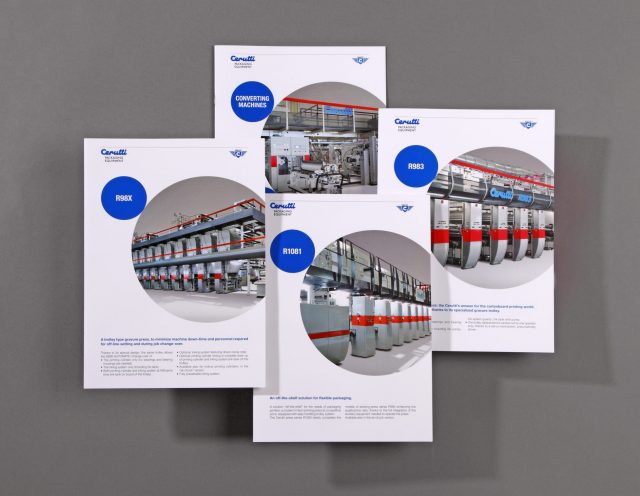
Big and imposing, the stand at Drupa 2016 tells the tale, alongside with the brochure and the Balance book of 2015, of a business reality that’s deeply rooted in its homeland, but at the same time in constant evolution.

A system of total identity, transversal to the many marks of the group, builds the core of the visual communication.


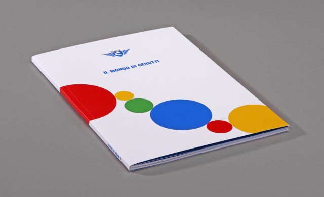
The key concepts of evolution and development are expressed visually by a series of circles of many widths, all linked together to create a chain of pictures: a mix of technology, history and values of the “made in Italy”.


