Kronos e Kairos
(Ita)
CLIENTE
Electa Mondadori per il Parco Archeologico del Colosseo
DATA
Luglio 2019
THE BRIEF
Imagine the identity of the Kronos and Kairos art exhibition, curated by Lorenzo Benedetti.
The project included the creation of the logo and the definition of the visual and verbal language, with the wayfinding, a caption and communication system along the way in the park. We also produced the institutional communication of the exhibition, the adv campaign on and offline; in addition we developed the catalogue concept, the printing project, the rudder and the graphic cage.
THE SOLUZIONE
A 360 ° Brand Design Strategy was conceived for this project, whose governance was applied in the areas of Corporate Design, Editorial Design, Space Design, Campaign Design, Service Design. The key of the identity system is the union between two different types of times, a synthesis of the interaction between historical and contemporary that has characterized the exhibition project on a thematic level, along with the choice of place and artists. The use of the gold color as a distinctive mark.
“The exhibition “Kronos and Kairos” presents works of contemporary art in places where time is enclosed in a strong dialogue with the past. A place that has its constant iteration with a series of different temporal dimensions referable to the past. Another historical period that the visitor tries to identify. The exhibition does not want to compare contemporary art with a place from the past, but wants to identify a space not contextualized by a linear chronological dimension, by a Kronos, and try to immerse yourself in a time that does not become a frame or a neutral context in where to insert the works. In this way we are faced with an antithesis of the white space.”
Lorenzo Benedetti
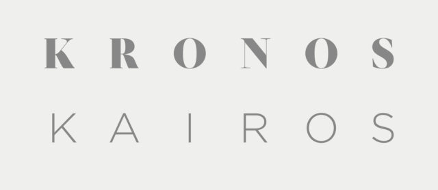
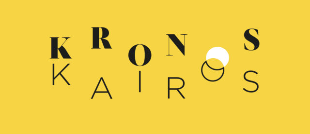
In the first phase of the project we carried out creative explorations diversified in terms of aesthetics, expressive and semiotic modalities to reflect together with the client on the values, objectives, positioning and target of the exhibition. Through a process guided by the Brand Strategy, we have defined the logo, optimizing it through the redesign of two very different fonts, symbolically joined by the O of the words Kronos and Kairos. The Brand Strategy process aimed at overcoming the problems of translation, reading and understanding in different languages, of distinctiveness within the Archaeological Park of the Colosseum and in harmony with the context.
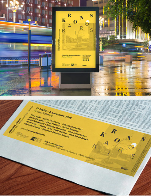
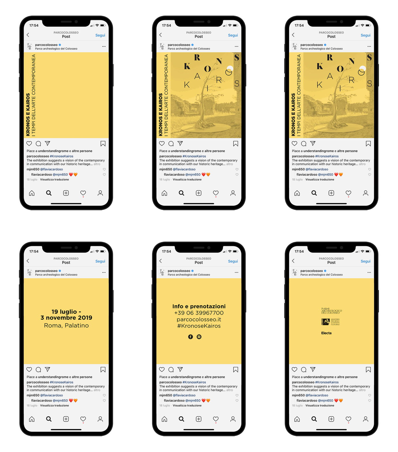
The cross-media communication campaign was developed by using the great dynamism of the compositional elements: the logo, the yellow and gold used differently online and offline, and the photographic images of the art works set up in the park.
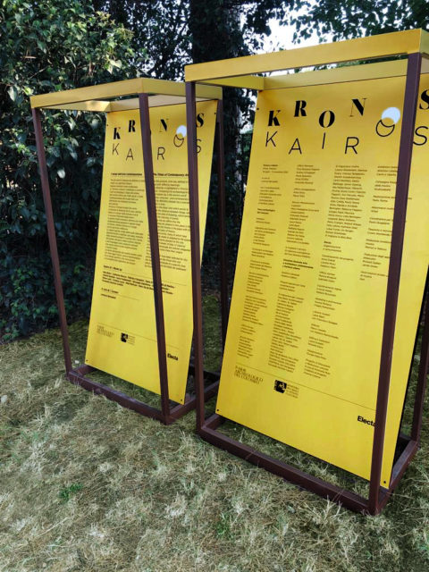
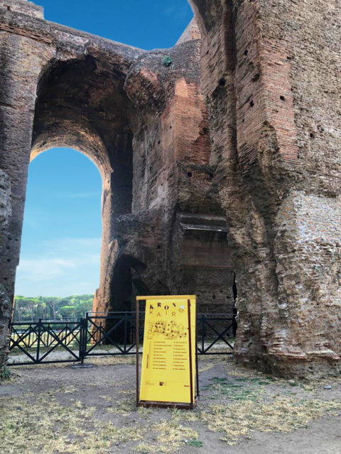
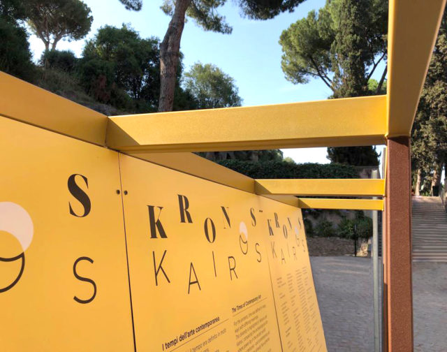
The map for each work, the captions, the biographical information on the artists in double language have been positioned according to an organic wayfinding and service design. The elements accompanied the visitor step by step in the exhibition path. The self-supporting structures have been designed to host contents permanently or semi-permanently, but also to be used again in future installations thanks to the fixing system that provides the diversification of the panels.
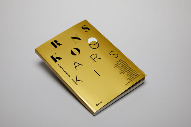
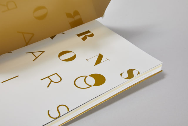
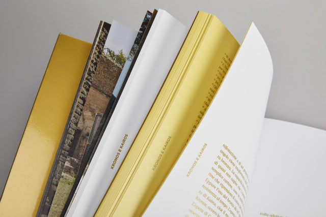
The catalogue is the element that sums up all the conceptual and exhibition aspects in question. For adherence to the theme, the cover is printed in iridescent gold, making the perceptual experience evolving. The concepts of Kronos and Kairos, as well as the resulting dualism, have been underlined, differentiated by the use of gold and yellow, by two fonts, and by the use of different paper.
