That’s right. We should scrap and destroy them, dispose of them from the perception world, and if possible also from other worlds.
That’s right. We should scrap and destroy them, dispose of them from the perception world, and if possible also from other worlds.
They are too many and continue to multiply. Rather than make new ones we should take the old ones and give them a new life, or better: let’s recycle them.
We can not, it would make no sense.
Brands seem to be uncontrollable, every day new brands are created, homemade, by the neighbor, by his friend who can draw very well, by anyone who is literate in the gestation of the signs. And today the works – works of art – in the age of mechanical reproduction – almost automatized- they are even easier to create, within the reach of an App. So it seems.
So these prints, images, emblems, are created already devaluated. They are neither rare nor unattainable, nor difficult to produce or to be reproduced; so where is their value, the sense that defines their status?
The beautiful thing is in thinking, designing, drawing signs that are potential containers of sense, and just there it is difficult for those who work in graphic design, trying to project into a seed the development potential of a tree with foliage, trunk and branches.
A brand in itself is not and will never be a tree, but it will contain the potential, the memory, sometimes it will determine its persistence. A brand is not a trademark, like a pear is not a pear tree, or a cell is not a life. But like life or the pear tree, the trademark without its origin, or better the brand, is not revealed.
For this reason, more and more brands are created. Because many activities seek their culture soil, and in this sense
saying culture – brand – is totally relevant.
Brand is an exercise of excellence of the graphic design, it requires expertise, skills in lettering, talent in drawing, awareness in design.
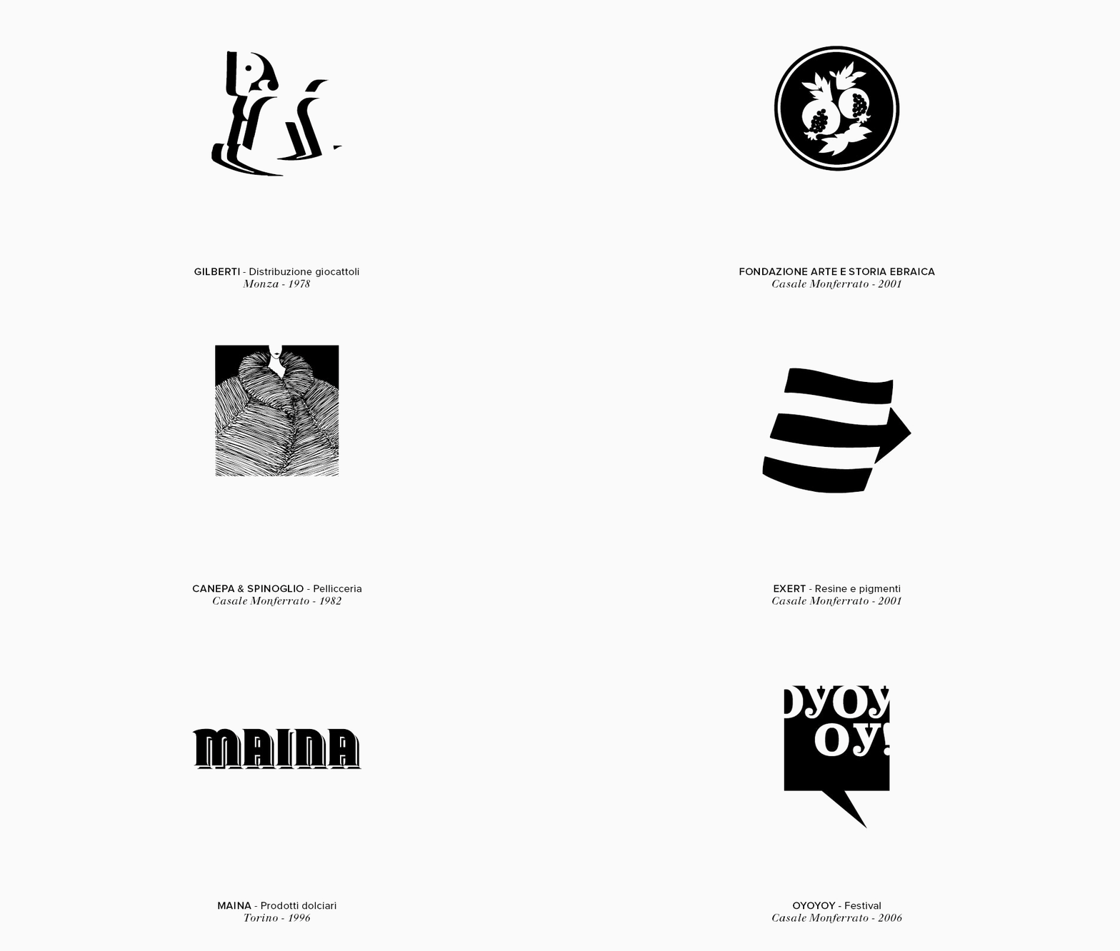
Brand is an exercise of excellence of the graphic design, it requires expertise, skills in lettering, talent in drawing, awareness in design. It can be created from an intuition and is the visual result of an inner journey full of accumulated experiences, or it can develop through a scientific process and is its direct consequence: in any case, it is a symbol that tends to combine concepts. These trademarks will be crucial for the spreading and identifiability of the brand, they will be its metonymy, in just a little there will be everything – or almost – and that little will be a convenient device to be recognized, the familiar sign of trust and good reputation. In our slides there are many brands, logos, distinguishing marks, realized for products, events, organizations, individuals. There are redesign exercises, new design, logotype, mascot. There is in all cases an invisible but fundamental path, the definition of objectives, functions and meanings. And then there is the game, purely visual, to create forms that have all the desire to be multiplied many times, to be positively remembered.
Download print version
