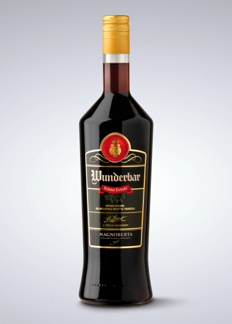
Magnoberta
Client
Magnoberta
Location
Casale Monferrato (AL)
Date
2016
Il Brief
To redefine the brand’s visual identity and to make the products’ labels more recognizable in the perspective of a market launch, concentrating in particular on rejuvenating the graphics.
Solution
To make the most of the graphic and textual elements in order to create a visual identity and a packaging that would be engaging for the consumer, but which would at the same time communicate the brand and its values with immediate effect.
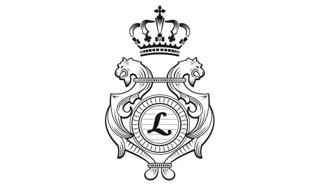
Starting from the original crest, which underwent a light graphic restyling, the mark was reworked in a more modern key to communicate better the company’s identity and its products, paying care not to lose the tie with its origins.
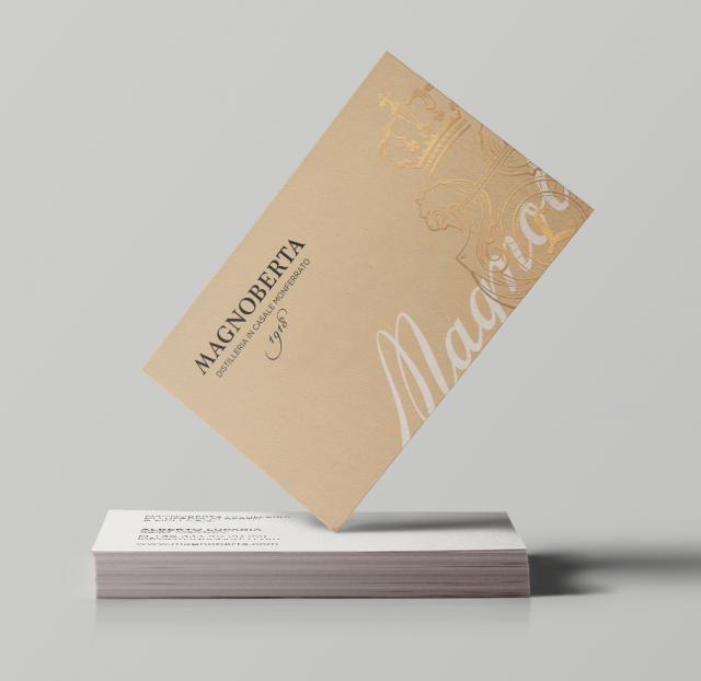
A PERFECT MIX OF TRADITION AND INNOVATION FOR THE VISUAL IDENTITY OF A HISTORICAL DISTILLERY WITH A MODERN CALLING.
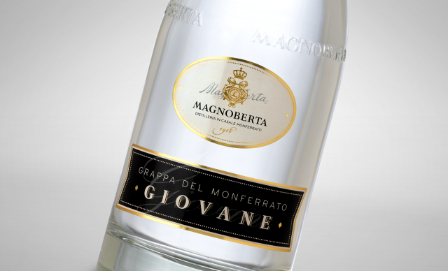
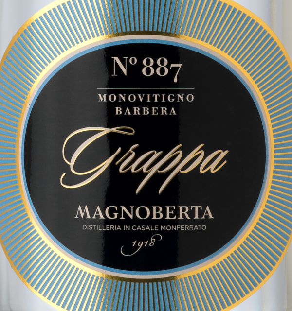
For the principal product of the distillery, grappa, we developed a design with a soft curve for the bottle and an elegant black label with gold writing, enclosed in a bright blue circle.
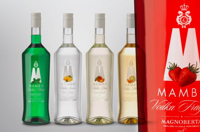
Lo storytelling trova nell’etichetta delle vodke Mambo lo spazio perfetto per raccontare la storia di un brand che, dopo aver lanciato la prima vodkalemon sul mercato italiano nel 1975, continua la sua evoluzione con le nuove e più moderne vodke a base di frutta.
Storytelling finds a perfect space in the labels of Mabo vodka to tell a stale of a brand which, after launching the first vodka lemon on the Italian market in 1975, continues its evolution with brand new fruit-based vodkas.

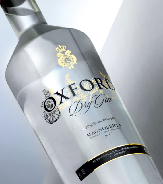
MAGNOBERTA, A PIECE OF HISTORY IN A BOTTLE.
