Dolomiti Bellunesi
CLIENTE
Provincia di Belluno
DATE
2022
CREDITS
Coordinated by: Provincia di Belluno, Direzione Generale
Strategy by: Yellow Railroad Ltd
Video: Qubit
THE BRIEF
The province of Belluno presents itself to the tourism market with the “Dolomiti Bellunesi” brand, coupled with the specific identification “The Mountains of Venice”. The aim is to strengthen the local economy by promoting the touristic charm of the area.
THE SOLUTION
The attributes Authentic, Spectacular, Cultural and Adventurous framed the development of the project. The shape of the brand relates to the landscape and the user experience, while also providing a common sign, meaningful across the whole territory.
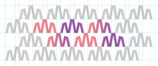
A careful study of the distinctive features of the landscape is required to design a logo for the visual identity of a territory. The amplified letter “M” recalls the landmarks of the Dolomite and makes reference to the inclinations that one has to face while climbing or hiking.


The DNA of the Belluno Dolomites is the essence of the Brand: Authentic, Spectacular, Cultural and Adventurous.
The identity for Dolomiti Bellunesi comes from the genius loci:
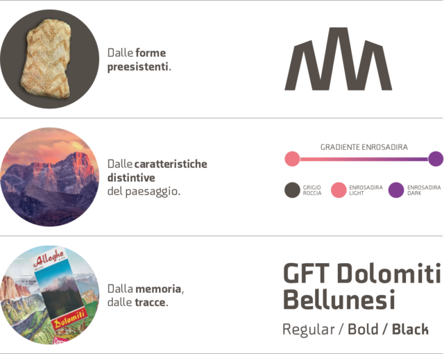
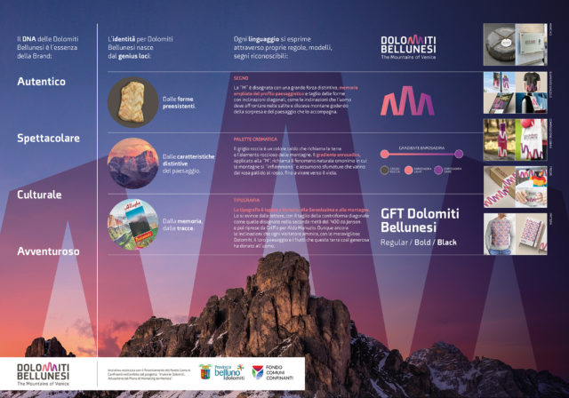
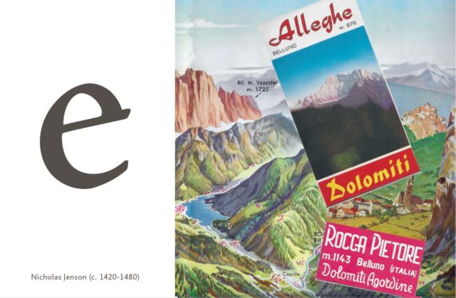
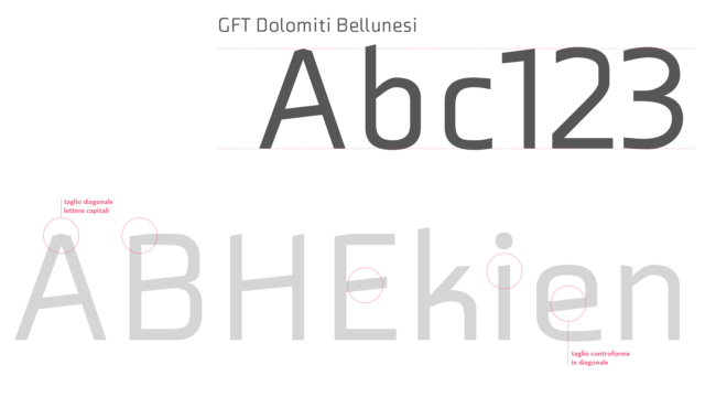
The GFT Dolomiti Bellunesi font was designed by the type designer Giangiorgio Fuga, at the Giò Fuga Type (GFT) foundry. It originates from the careful study of the typographic tradition linked to Venice and its mountains, the Belluno Dolomites, which led to the creation of, for instance, the diagonal cut of the counterform of the letter “e”, as it can be seen in the letters engraved in the second half of the 1400s by Nicholas Jenson and then taken up immediately afterwards by Francesco Griffo for Aldo Manuzio.
- Rock gray is a warm color that recalls the earth and the rocky element of the mountains. The enrosadira gradient, applied to the “M”, refers to the natural phenomenon of the same name in which the mountains “ignite” and take on shades ranging from pale pink to red and purple.

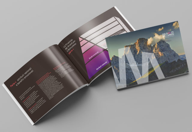
The toolkit includes the brand guidelines and provides the principles of application for the destination brand. It describes the mood, tone of voice and language to be used, in line with Yellow Railroad Ltd’s research.


