We2sure
CLIENT
We2sure
DATE
2021
CREDITS
Planner strategy:
Alessandra Lanza
Website development: Paperplane factory
THE BRIEF
We2Sure, Irish startup of sustainable micro-insurances, needed to develop a branding path in order to better focus its own visual and verbal identity, furthermore its conceptual positioning in the target market.
THE SOLUTION
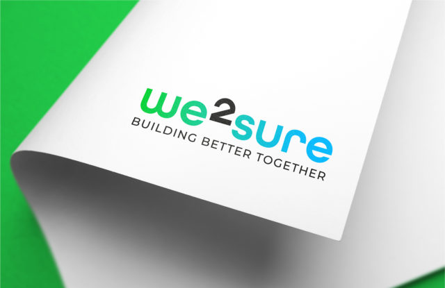
The strategic approach Design Oriented has allowed to define the values and the attributes of We2Sure. To strengthen the brand promise, it’s been created a payoff in order to underline the ethic aim of the Company.
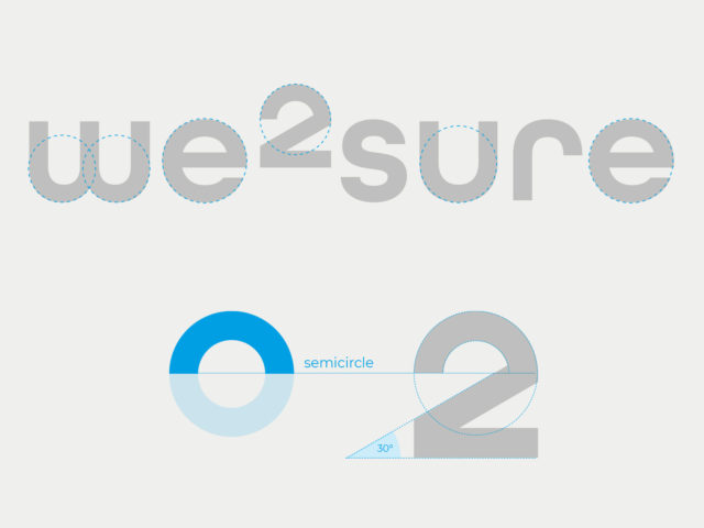
The visual identity translates the idea contained in the new payoff “Building better together”. The number “2” becomes an exponent which communicates the connection between the involved actors. The colors are lively, and the gradient describes dynamism, transformation.
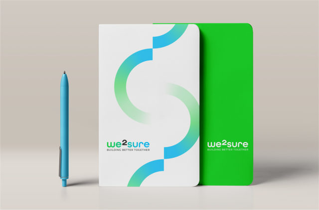
The design of logotype is based on circles and semicircles. These becomes the main identity elements of the brand language, confirming the innovation and the dynamism of the new brand.
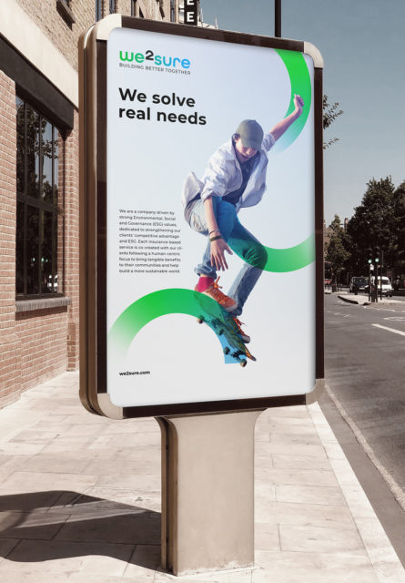
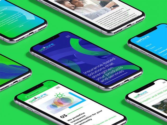
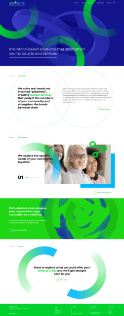
The visual system works on different media, including the website of which we handled design, copy and development.
